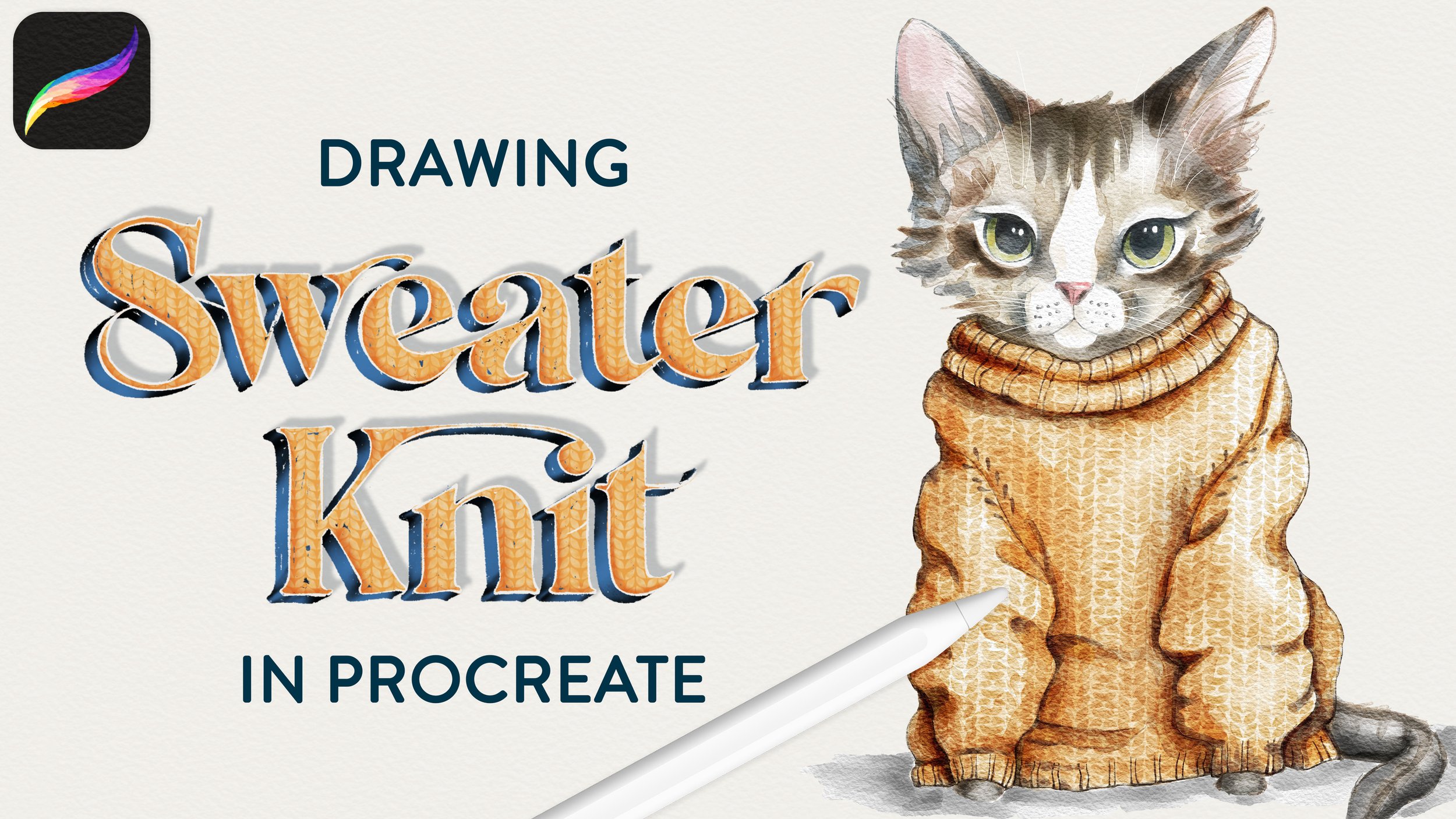
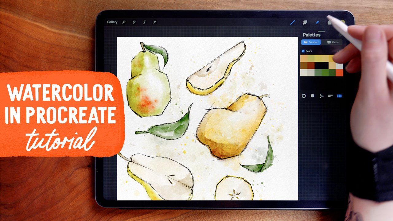
How to Oil Paint Digitally
super real oil painting - on your ipad!
Can you believe this is digital? LOOK AT THIS TEXTURE. !!!!
This video touches on blend modes for shading and highlighting, some flower drawing fundamentals, and also goes over some specifics on using these brushes. You can def use other brushes - including the default Procreate oil brushes! - your results will just look a little different. :)
Read on for the how to get this oil on canvas look + how to paint a still life!

BRUSHES USED:
Procreate Pencil (Under “Sketching)
Syrup (Under “Inking”)
AN Canvas Texture Oliver
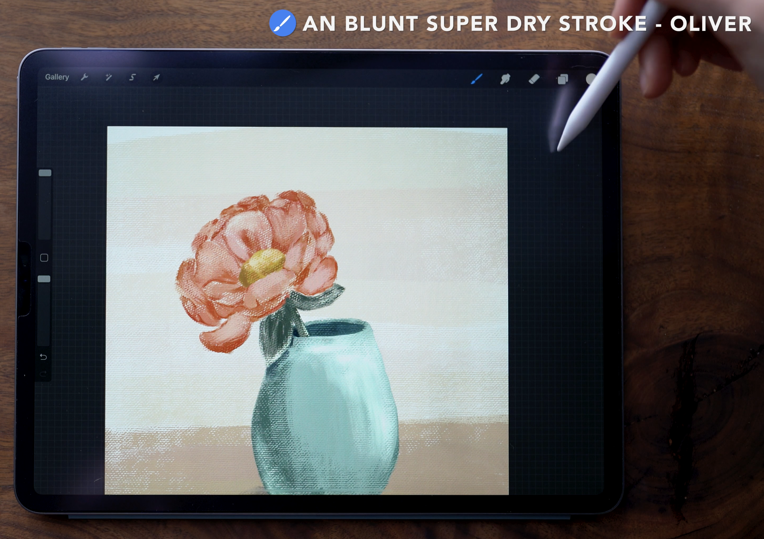
AN Blunt Super Dry Stroke Oliver
AN Brushtacular Express Oliver
This brush pack has four different, distinct textures, so if you are using the pack, feel free to mix it up to get a different look!
Color palette:
I used colors from my July color palette, which I send out to my newsletter subscribers. You can get access to it (and other great freebies!) by signing up here:
Canvas texture & Set up:
To start off, I'm working in a blank canvas that's 3000x3000 pixels and 300dpi. I'm using my topmost layer to lay down the canvas texture, using a mid grey color. With the Canvas Texture brush size set to 100%, use one stroke to fill the entire canvas. Then in the layer panel, change the blend mode to Multiply, and reducing the opacity to whatever intensity you like - I set mine to 30%.

Flower Framework:
Move onto the layer directly beneath the texture, to lay out the framework to sketch the flower. For this I used the Procreate Pencil from the Sketching panel.

Start off with three ellipses: the largest for the widest point of the flower, the medium for the lowest point of the petals, and the smallest for the very center of the flower.
Sketch:
Switch to a second sketch layer for the actual sketch. You can continue to use the pencil, but to get bolder linework, I used the Syrup brush from the Inking panel. Working around the circumference of the flower, sketch in the petals, using the framework as a guide as to what the perspective should be.
In this case, that means the petals closest to me are foreshortened, the petals on the side have some slight curvature of the side edges, and the petals furthest away appear the longest.
Start off with four petals in a north-south-east-west layout, and then fill in from there. Begin by drawing in a single layer of petals - and then add in additional layers in front and behind. Depending on the type of flower, you can also add in a couple petals that are so open they fall outside of the circle framework.

Petal Color fill:
In the layers panel, you can hide framework layer, and then move onto an empty layer beneath the sketch. For the petal color, I used a peachy pink.
Use the Blunt Super Dry Stroke brush to lay down this initial color. This brush is has some hue variation between strokes - I love how it looks like you actually are mixing the colors as you paint. It also has a lot of texture that shows through.

An important note with these brushes: it's best to keep the canvas completely level - so, not tilted- as you're painting. I don't always remember to do this- you'll see me forget once or twice as I paint in the video - , but what that means is the texture won't totally match up with the canvas texture. If you catch yourself before you paint the whole thing on a tilt, it probably won't be too noticeable.
Adding definition
After filling in the petals, move on to a layer above the petal fill layer.
Change the blend mode to multiply, and use the same color that you used for the petals. Change the brush opacity to 50%, and brush size to about 5%.


Now work around the flower, layering in this color to add definition to the petals. By using this brush to define where each petal overlaps with others, you’ll be able to hide the sketch layer later on and maintain the detail of the flower. You can also reduce the opacity of the sketch layer so that you can see more clearly where to add the definition.
Blending
Switch to the smudge tool, set on the Blunt Super Dry Stroke brush, to blend out some of the color. Set the brush size to 12% here.
Essentially, you’re trying to soften the edges of the strokes by blending the color out. Because it's a lower opacity, and on a separate layer from the petals, this will maintain the shape of the petals as well as the original texture fro those brush strokes.


When using a brush set to a lower opacity, sometimes you'll find you want to increase the intensity without actually painting more strokes. An easy way to do this is to duplicate the layer, adjust the opacity of the duplicate accordingly, and then merge the two layers together. Then this layer with the initial petals layer.
Flower center
On an empty layer above the Petals, grab a yellow color and use the Blunt Super Dry Stroke brush to paint the center of the flower. Set the brush size here is set to 14%.

Flower stem, leaves, and shading
Choose a dark green to paint the leaves and the stem, keeping the brush size at 14%. Then, switch to a lighter green to add some dimension. For this, add a new layer above the greenery layer, and make it a clipping mask.

Use super light pressure to paint this in. This allows a lot of texture to show through from the layer below.
Choose a darker yellow to shade the left edge of the flower center, again using really light pressure. Finally, with a light yellow, add a bit of highlight opposite of the shading on the center.
Add a layer above the petals layer, and change this to a clipping mask as well. Then, use a lighter pink to paint in a little bit of really soft highlight on the petals, adding more dimension.

Adjust the composition (if necessary)
In the example, I decided to adjust the composition to make my flower tilted, so it works better when adding the vase. I did this by going into the layers panel, selecting all of the layers except the top texture layer, and using the selection arrow to make the changes.

Painting the VASE
Add a new layer at the very bottom of all the layers to paint the vase. Select the Blunt Super Dry Stroke brush for this, with the size set to 22%.
Begin by roughly painting the vase shape. You can see in the example that mine isn’t symmetrical - to be honest, I didn’t realize how off it was right away! I went back in after to shave off the sides to get the shape right.
What's important here to to have this slightly rounded top - a convex curve - and a slightly rounded bottom.
Then on a layer directly above the vase, use a darker teal to paint a very narrow ellipse. This will indicate the inside of the vase.

Pop back up to the greenery layer to remove the stem. With the selection tool set on Freehand select, carefully draw a selection that follows the line of the teal ellipse, and then encircles the rest of the stem that should be inside the vase. Tap back on the starting dot to close the selection, and then use three fingers to scrub the screen, which will clear the selection.

Now merge the teal ellipse layer with the vase layer. This is where I used the eraser tool to sculpt the shape of the vase to a more rounded and symmetrical shape. :)
shading the vase
Add a layer above the vase layer, set to a clipping mask and the Multiply blend mode. With the Blunt Super Dry Stroke brush set to 38%, choose a darker mint green. Use extremely light pressure to build up the pigment so it is darkest on the outside edge, and then fades toward the center.
To add in a little more shadow under the leaf and on the inner rim of the vase, adjust the brush size to 3%
Repeat these the steps with a darker green, this time staying even further towards the edge, and fading sooner than before.
Switch back to the mint of the base color of the vase. Add a layer above the shading layer, blend mode set to Add, and change this to a clipping mask. Set the brush to 20% opacity, and size to 45%.

With light pressure, brush in a highlight on the upper right side of the vase, following the curvature of the vase. You can also add in a slight bounce light on top of the shadow on the lower left.
Shadow
Add another new layer to the very bottom of the layers panel. Select a dark blue to add a shadow beneath the vase.
Set to the brush size to 27%, and the opacity at 45%. Again using light pressure, build up this shadow, making it darkest closer to the vase, and then fading out toward the edge. If it looks a little to intense, you can adjust the layer opacity. Here, I set mine to 60%.

Background
Add a final layer at the very bottom of the layers panel. For this background, set the brush to 100% for size and opacity.
You can have fun with this background or follow what I did - I used a tan color for the lower portion of the background, and then a pale peach color for the rest, to make it look like it is sitting on a surface.
Start painting now, or pin this for later!

Get the color palette for this tutorial!

JOIN THE PACK
When you join, you'll gain access to dozens of Procreate freebies: brushes, paper textures, workbooks, and color palettes. I send out weekly updates with my best tips and tricks, and you'll be the first to hear when new freebies are released!