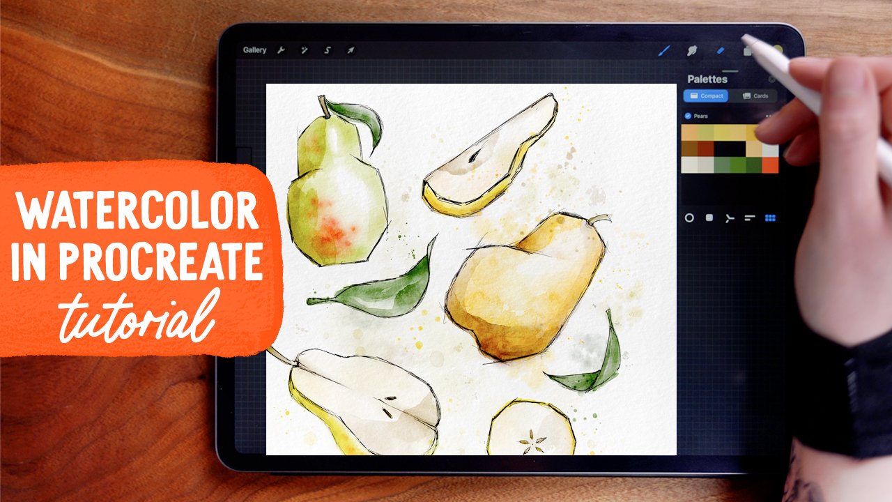
Paint Watercolor Fruit in Procreate: Pears
In this tutorial, we are painting some ink & watercolor fruit (pears specifically!) in Procreate on the iPad. I'm using my watercolor brushes, linked above, which I recently updated to include many many MORE brushes. I'll show you how to draw five different pear shapes and slices, how to achieve realistic looking watercolor effects, and how to use these brushes to their fullest extent to create super authentic watercolor style paintings, digitally in Procreate. Watch the video or read on for the step-by-step instructions!
Brushes
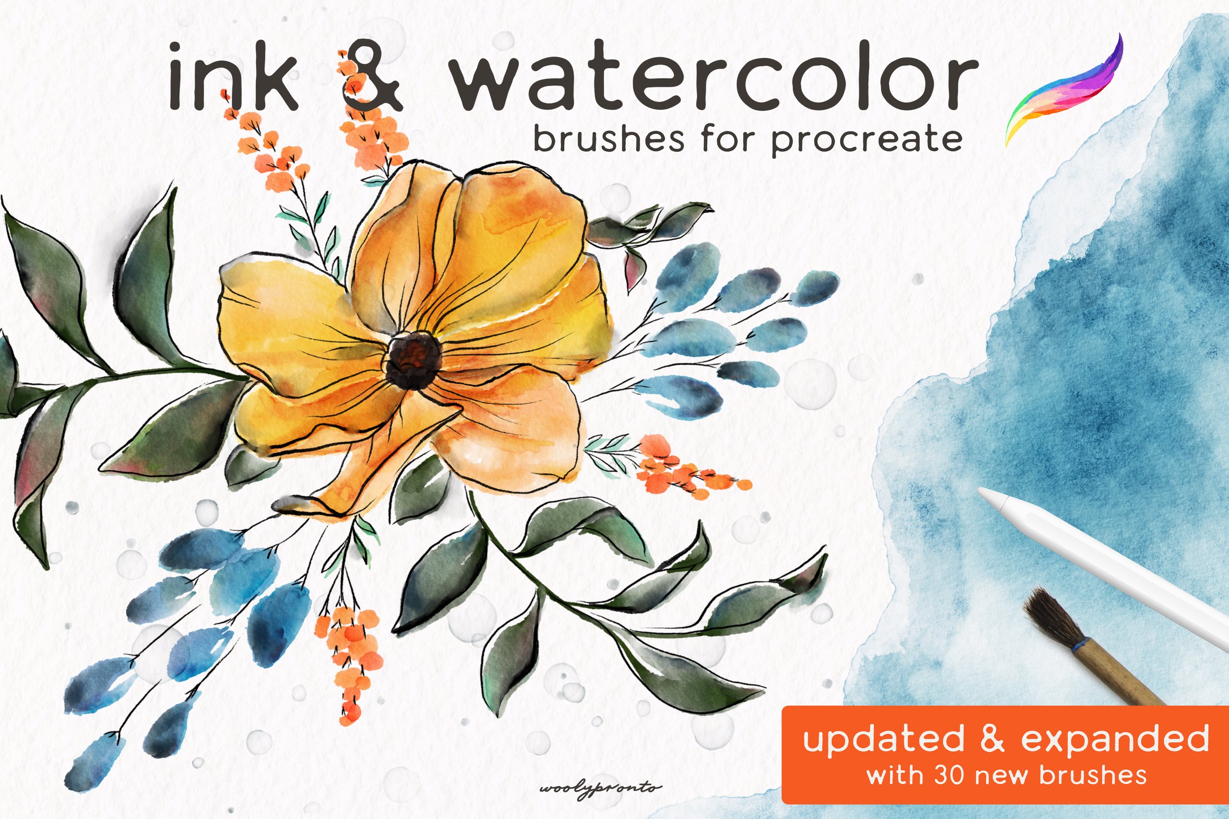
NEWLY UPDATED - now includes over 50 brushes! Bring the perfect pairing of Ink & Watercolor to your iPad. This pack includes an array of opaque inkers, diluted watercolor brushes, and rich textures. Achieve ultra-real effects and that happy-accident analog look with these watercolor brushes.
Included in the updated & expanded set:
14 watercolor brushes
10 ink brushes
27 watercolor texture stamps, splatters, and texture brushes
1 .Procreate file with 3 different paper textures contained within
Designed to provide an intuitive painting experience, you can blend as you paint by varying the pressure applied. Subtle color variation in each stroke recreates a mixed-paint appearance.
Great for any skill level, adding ink linework to watercolor elevates even the simplest painting! This set includes gritty, streaky inkers, and smooth, buttery pens. No need to wait for the watercolor to dry – simply add a layer on top and start inking!
File Types: .BRUSHSET, .PROCREATE
Due to large file size, you will be sent a link to download a PDF document containing the Dropbox link.
For this project, I’m covering all the updates included in the Ink & Watercolor Brushset.
Designed to provide an intuitive painting experience, these brushes help you achieve ultra-real effects and that happy-accident analog look.
NEWLY UPDATED - now includes over 50 brushes! Bring the perfect pairing of Ink & Watercolor to your iPad. This pack includes an array of opaque inkers, diluted watercolor brushes, and rich textures. Achieve ultra-real effects and that happy-accident analog look with these watercolor brushes.
Included in the updated & expanded set:
14 watercolor brushes
10 ink brushes
27 watercolor texture stamps, splatters, and texture brushes
1 .Procreate file with 3 different paper textures contained within
Designed to provide an intuitive painting experience, you can blend as you paint by varying the pressure applied. Subtle color variation in each stroke recreates a mixed-paint appearance.
Great for any skill level, adding ink linework to watercolor elevates even the simplest painting! This set includes gritty, streaky inkers, and smooth, buttery pens. No need to wait for the watercolor to dry – simply add a layer on top and start inking!
File Types: .BRUSHSET, .PROCREATE
Due to large file size, you will be sent a link to download a PDF document containing the Dropbox link.
Free Brush Sampler
If you sign up for my newsletter, you can download a free sampler of the Ink & Watercolor brushes. You’ll also get everything else in the Resource Library - dozens of free brushes, canvases, and color palettes! Sign up for this and tons of other goodies:
Canvas Set Up & Color Palette

We’re using the paper texture canvas that comes with this brushset, with Paper Texture 2 and Splatter Option 3. These will help give a very realistic look to our watercolor. If you’re following along and don’t have the set, that’s totally ok! Just be sure to use a paper texture of some sort - I have several available in the Resource Library when you sign up for my newsletter.
You can download the free color palette we’re using in this project by clicking HERE!
Ink Linework
In the upper right side of the canvas, start sketching in a basic pear shape: larger on the bottom, narrowing in toward the top. We’re using this sketchy, slightly angular style for these pears - using the Fine Tip Liner brush, which is made to emulate fine micron ink pens. Feel free to be messy with this - it adds to the look!


As we draw in the pears, pick different angles or slices to vary it up! For the second one, I’ve drawn this on its side.
To add to the sketchy look, extend intersecting lines beyond the pear. Try to keep the line weight and style consistent along the way.
For the next pear, we’re drawing this to be a cut half of the fruit, sitting on a slight angle. First, though, draw it as though you were viewing it straight on.
Be sure to add some teardrop shaped seeds, and some lines to indicate the core at the center of the pear.
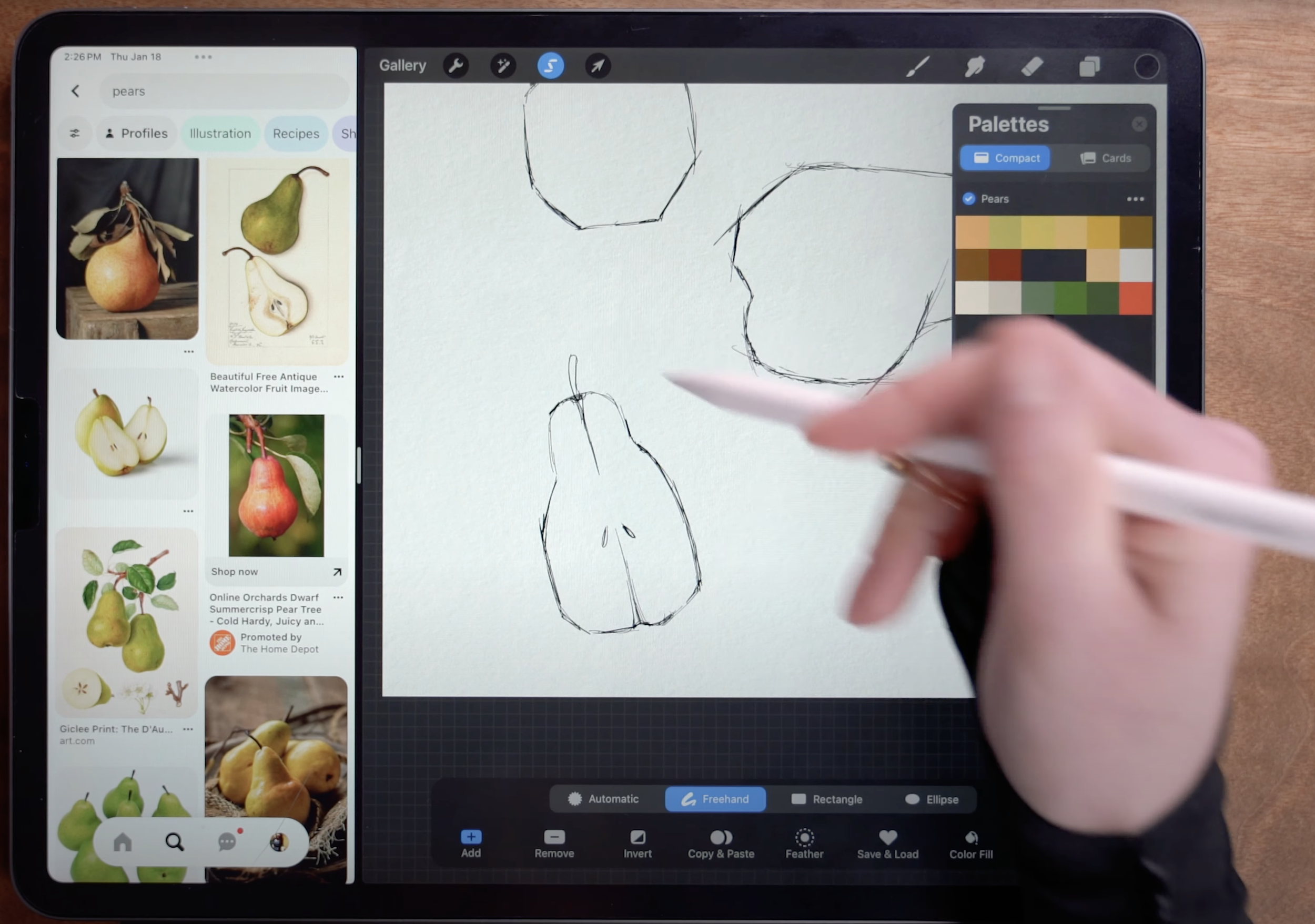

Next, use the Freehand Selection tool to draw a selection around the pear. Then switch to the Transform tool, set to Distort, to stretch and skew the pear until it is in this sheared perspective. We’re going to draw in the peel next, and this trick helps you get the perspective right without guesswork.
Now sketch in the peel on the side of the pear, starting at the top near the stem, widening along the middle, and then connecting back with the original linework at the bottom.


Draw in a couple more slices, cut in different ways.
You can also add a couple leaves to fill out the composition. In the video, you’ll see that I use the selection and transform tools several times to adjust the overall composition and spacing of each pear.
Once my composition is done, I’m using the Transform tool to make sure it is relatively centered on the canvas before we move on to the next step - painting the watercolor!


Move to a new layer below the linework.
For the watercolor, we’re filling in a base layer of color first, using the Mid Texture Watercolor (No Edge) brush. This brush allows you to blend as you paint, helping achieve lots of pigment variation to add to the realistic watercolor effect.
Here’s what it looks like with all the base layer of color filled in! We’ll add emphasis to the shading and overall watercolor texture in the next few steps.


On a new multiply layer, below the linework but above the base painting layer, use the Glaze Brush to add in some layered shadows. This brush does not blend as you paint, but adds a lot of texture and character. It naturally has a dark outer edge when you paint, just like real watercolor.
Add a new layer, set to multiply, above the last layer (still below the linework). Choose different watercolor splotch brushes to layer on top of the painting, using the Transform tool to reposition them.


Then use Freehand Select to draw around the part of the stamp that doesn’t overlap, carefully following the outline of the pear. Then switch to the Transform tool to drag the remainder of the splotch off the canvas.
As a final step, use a variety of the splatter and droplet brushes surrounding and overlapping the pears. Use the same colors from the painting itself to help tie it all together. Here I’m using the Wet on Wet Splatter brush on low opacity to make it look like the paint spilled over the linework a bit.

And that’s the finished piece! Paint away, and share your lovely work (and feel free to tag me @woolypronto so I can see)!
NEWLY UPDATED - now includes over 50 brushes! Bring the perfect pairing of Ink & Watercolor to your iPad. This pack includes an array of opaque inkers, diluted watercolor brushes, and rich textures. Achieve ultra-real effects and that happy-accident analog look with these watercolor brushes.
Included in the updated & expanded set:
14 watercolor brushes
10 ink brushes
27 watercolor texture stamps, splatters, and texture brushes
1 .Procreate file with 3 different paper textures contained within
Designed to provide an intuitive painting experience, you can blend as you paint by varying the pressure applied. Subtle color variation in each stroke recreates a mixed-paint appearance.
Great for any skill level, adding ink linework to watercolor elevates even the simplest painting! This set includes gritty, streaky inkers, and smooth, buttery pens. No need to wait for the watercolor to dry – simply add a layer on top and start inking!
File Types: .BRUSHSET, .PROCREATE
Due to large file size, you will be sent a link to download a PDF document containing the Dropbox link.
Start painting now, or pin this project for later!

Get FREE Procreate Palettes in Your Inbox:

JOIN THE newsletter fam:
When you join, you'll gain access to dozens of Procreate freebies: brushes, paper textures, workbooks, and my entire library of color palettes. I send out updates each week with my best tips and tricks, and you'll be the first to hear when new freebies are released!