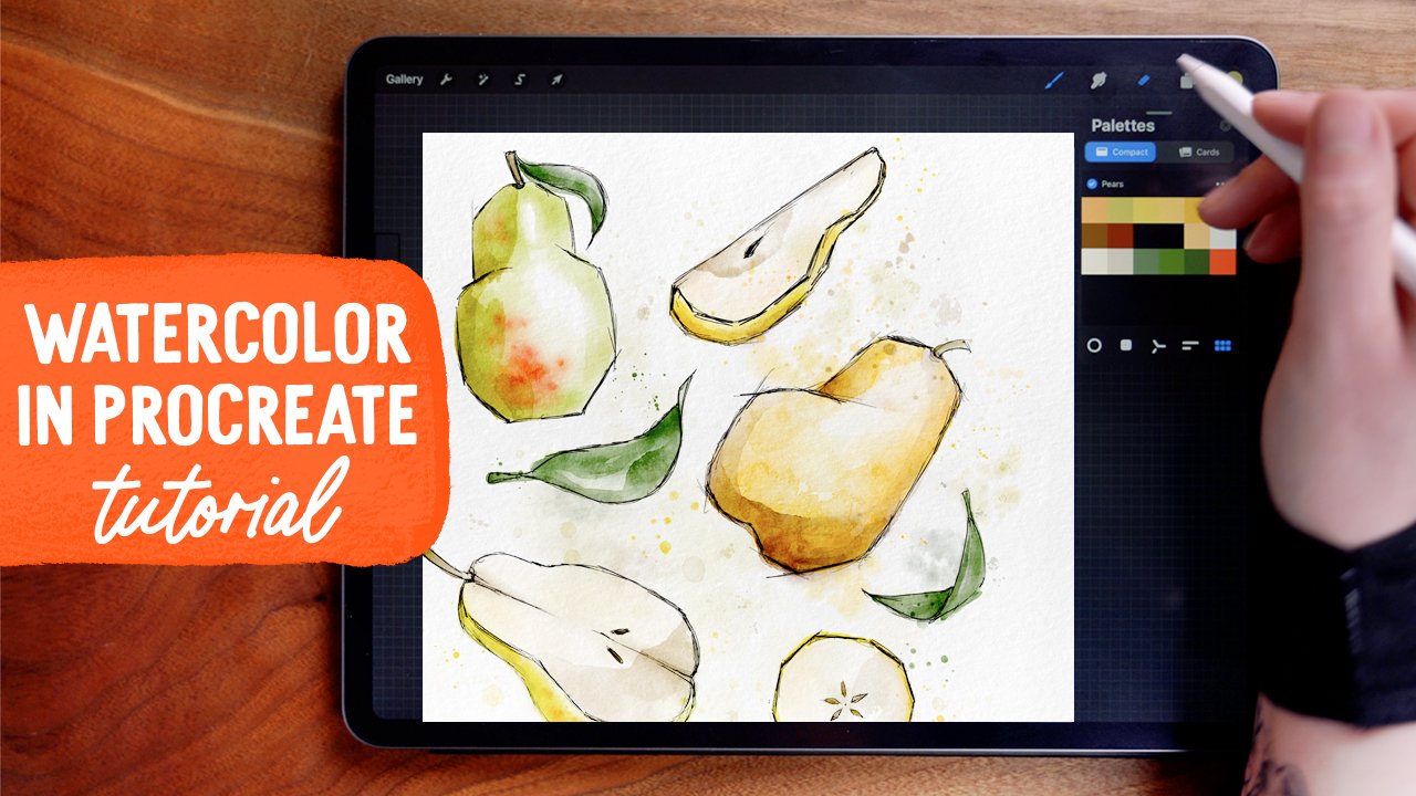
Paint, Shade, & Highlight: Succulents in Procreate
Click below to jumpstart your succulent art!
I’m using a succulent I created using my Succulent builder kit. In addition to individual leaves, the set includes 24 different pre-built succulent plants that you can use as your jumping off point for this tutorial, just like a sketch.
Read on for the tutorial on painting, shading, and rendering!


BRUSHES USED:
You’ll use:
Oberon Brush (smudging, painting, and erasing) - Under “Drawing” in brush panel
Soft Airbrush (painting shadow) - Under “Airbrushing” in brush panel
A paper texture
I used the Canvasy Overlay from Uproot Brushes Overlay pack. Check it out here (and use my affiliate link to take 10% off with code WOOLY10 at checkout):

You can use any paper texture you like, or skip it. This brush pack has tons to choose from, and I like the oil-on-canvas effect this specific one has.
Color palette:
I’m using colors from my July color palette, which I send out to my newsletter subscribers. You can get access to it (and other great freebies!) by signing up here:
Color fill:
When painting the succulent, it helps to think of it as a bunch of independent objects (that is, a bunch of leaves) in a collection (collection being the plant). Working like this will not only give your leaves definition in this color fill step, but it also makes it more manageable to shade and highlight later on!
To start, I have my succulent framework that I've stamped out from my Succulent builder kit. I’ve set up my texture layer, set to the Overlay blend mode, above all my painting layers.

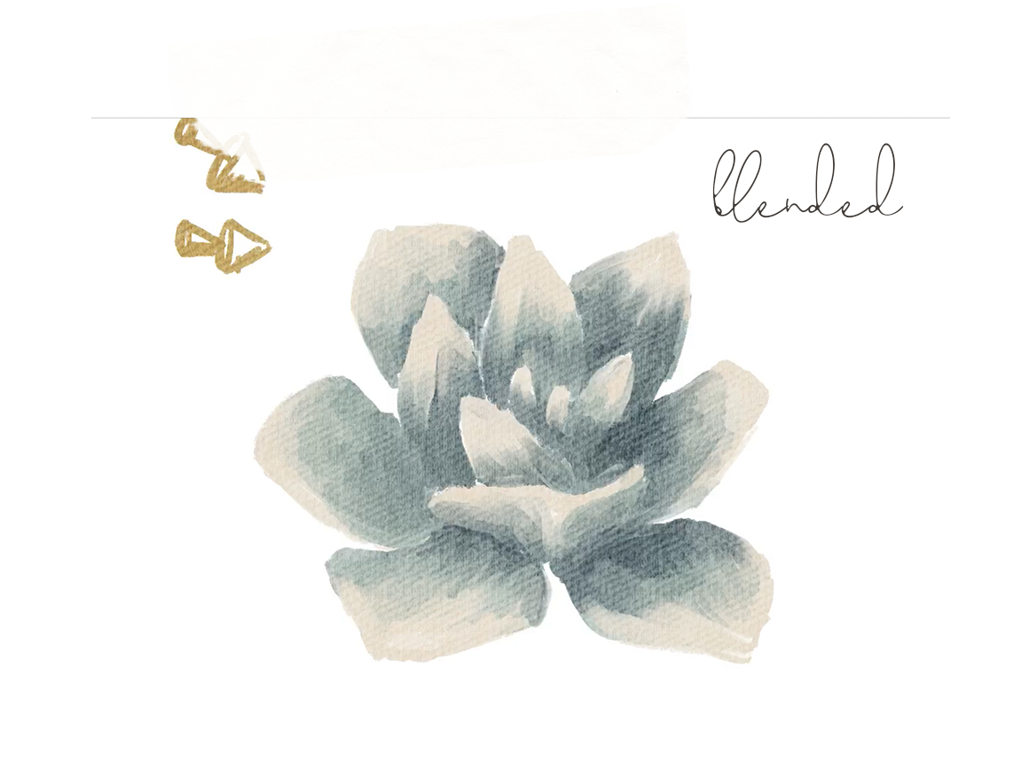
I'm starting the drawing with Oberon brush from the Drawing panel, and I'll also be using this for smudging and erasing. Working on my color fill layer, I'm going to start with a mint green, and paint in the primary coloring of each of the leaf. My brush size is set to 12%.
I'm painting a gradient fill here, so this I'm only coloring with this mint about 3/4 of the way.
Then, switching to a cream color, I'm going to use super light pressure to paint the remaining top portion of each leaf. Light pressure helps to layer the color in, and I’m overlapping a bit with the mint.


Then, switching to a darker teal color, I'm adding this in on the bottom quadrant. We're going to be smudging this out, so I'm not focusing on making perfect brush strokes, but instead just laying down color. Next, I'm turning off my outline layer to clean up the leaf edges. The outline is a bit wide, so this will ensure that my leaves look nice and tidy.
Blending
With the smudge tool, I'm still using the Oberon brush, with the size to 9%.
On this smudge step, I'm trying to smooth the transition of colors, using lots of little strokes to pull the color around. Because this brush has such a defined, hard edge, it does take a little more time to get a smooth blend - but I'd say don't try to make it totally perfect -this is definitely supposed to be an artful interpretation, so the brush strokes are part of the character of this.
SHADING
In the layers panel, I'm setting this shadow layer blend mode to color burn, which will give a more saturated and darker mix of this blue shadow with the color fill painted beneath.
I'm selecting a dark blue, and setting my brush size to 7% and opacity to 50%.

If we were to draw shadows on leaves standing separately, as pictured here, they'd have some form shadows, which is shadow on surfaces of the leaf where the light doesn't reach around. Then they would also each cast separate shadows on the surface they were standing on. The cast shadows would be darkest closest to the base of the leaf, and then would soften as they got further away, and more light filled the area. So this here is an example of what cast shadows would look like.
But for drawing an actual plant, and not just leaves standing upright, the shading process will be a little different. Cast shadows will fall on other leaves, which can be confusing to delineate from form shadows. Go slowly, take your time, and try not to over think it!
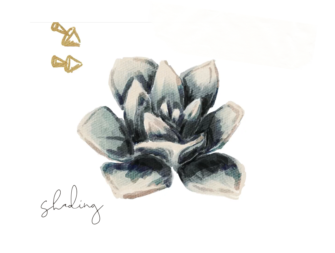
As I go, I'm shading the parts that the light wouldn't reach, and also adding shade along the contour lines, where the edge of the leaf would interrupt the path of the light.

Switching to the smudge tool - with the size set to 15% - I'm going to blend to soften these shadows. Be careful not to over blend on this step - you'll want to maintain a certain level of crispness and contrast, especially at the edges of the leaves. But most shadows soften as they mix with light, so some blending helps make this look more natural.
HIghlighting
Moving on to the highlight layer - I'm changing the blend mode to Add, and selecting the same cream I used before. I'm keeping this brush opacity set to 50, and the size is set to about 9%.
Because the Add blend mode makes this especially bright, I'm just adding the slightest touch of highlight to the parts that would be hit the most by the light. So that's the upper, outer edge, and a little bit on the inner edge as well.


Then using the smudge, tool, I'm softening this out to make it look more natural - again, respecting the edges to keep a high contrast.
Scene shadow
Finally, I'm going to add some shadow underneath the entire plant. This will make it look more finished, like it's sitting in an environment and not just... floating in space. :)
For this step, I'm using moving on to a layer below the rest of my painting layers, and selecting a dark blue. I'm using the soft airbrush from the airbrush panel, and setting the brush opacity to about 20%, and the brush size to about 35% to start.
Working on the side furthest from the light source, I'm softly brushing in some shadow here, staying pretty close to the plant itself.
Then I'm going to increase my brush size to 65%, and I'm moving a little further from the plant here to extend the shadow out. Because this is on such a low opacity, I'm able to build up the color in a pretty natural looking way.

To make the shadow softer, I'm going to my adjustments panel on the top left (the wand icon), and selecting Gaussian blur. Using my pencil to draw from left to right, I'm blurring this to about 22%. Then, in my layers panel, I'm reducing the layer opacity to about 56%. Finally, I'm tapping the selection arrow to select the entire shadow layer, setting the mode to freeform without magnetics, and squishing the shadow down slightly to better fit the perspective.

I'm also changing the shade and light layers to be clipping masks over the color fill layer. This will slightly reduce the intensity of the color burn layer, which I think is a good thing here. It also keeps any overlap of the shade and light layers from showing up where we painted the shadow on the scene layer.
Here’s the final piece!

Start painting now, or pin this for later!

Get the color palette for this tutorial, free!

JOIN THE PACK
When you join, you'll gain access to dozens of Procreate freebies: brushes, paper textures, workbooks, and color palettes. I send out weekly updates with my best tips and tricks, and you'll be the first to hear when new freebies are released!