Procreate 5 Brush Studio, Explained
6 BRUSH SETTINGS ADJUSTMENTS TO MAKE
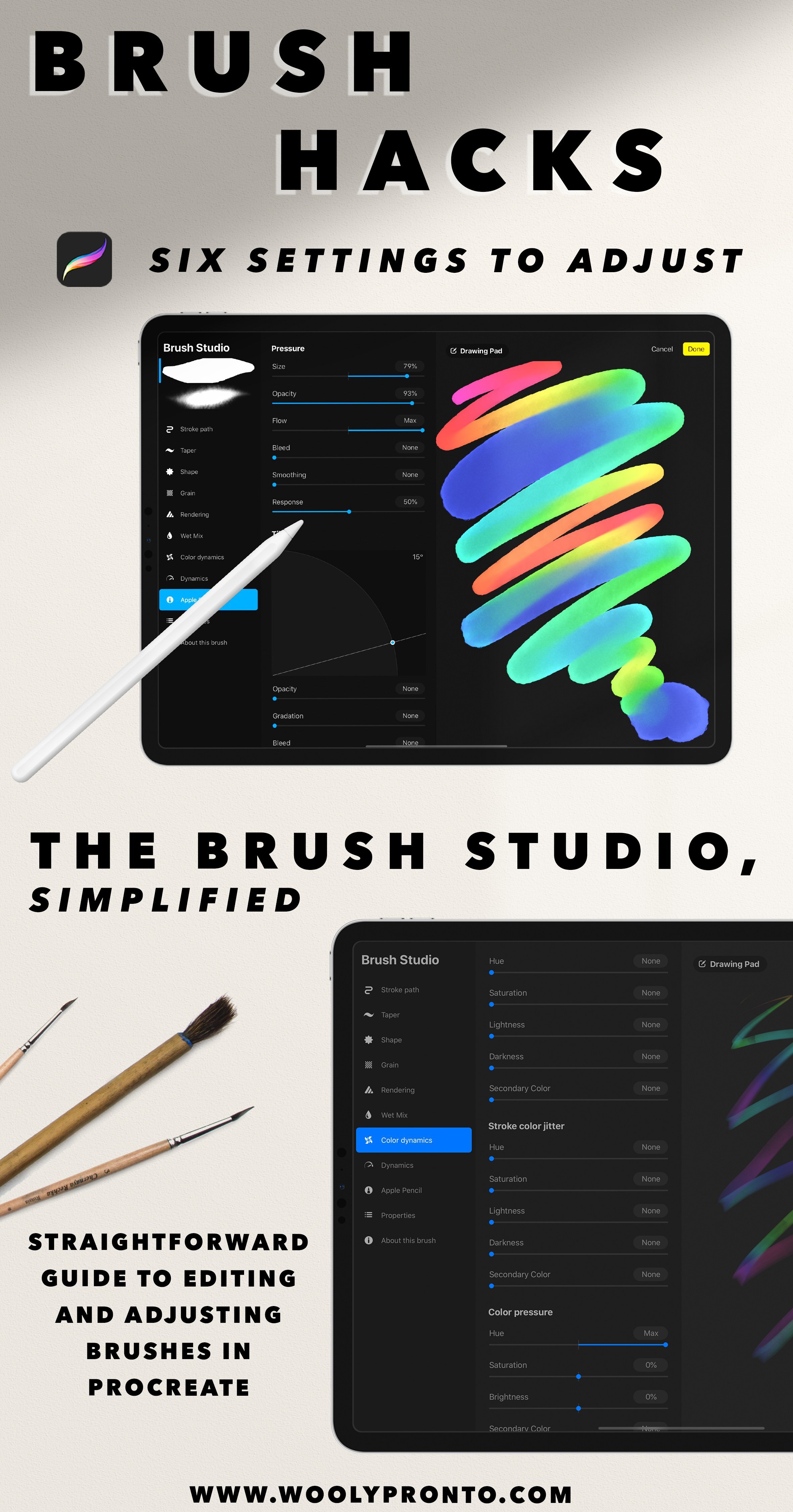
With the brush engine released with Procreate 5, it can be overwhelming to navigate through the capabilities. But sometimes, just a simple adjustment or tweak can totally revolutionize a brush. I'm excited to share some super easy ways you can customize the brushes you already have in your library. This is also one of those building blocks that might help dip your toe in the water of learning to make brushes, if you've been thinking about it.
Before I went to college for fashion design, I taught myself how to sew, and that process was a lot like this - I would take apart and analyze my existing clothes, or stuff I'd thrifted, and learn how to put it back together in a new way. That is pretty much what we're going to do here: we're going to jump into the Brush Studio, look at how the brush is made, and then put it together in a NEW way, a way that maybe fits us better.
Follow along with the video, or read on for the written guide!

Back Up & Reset
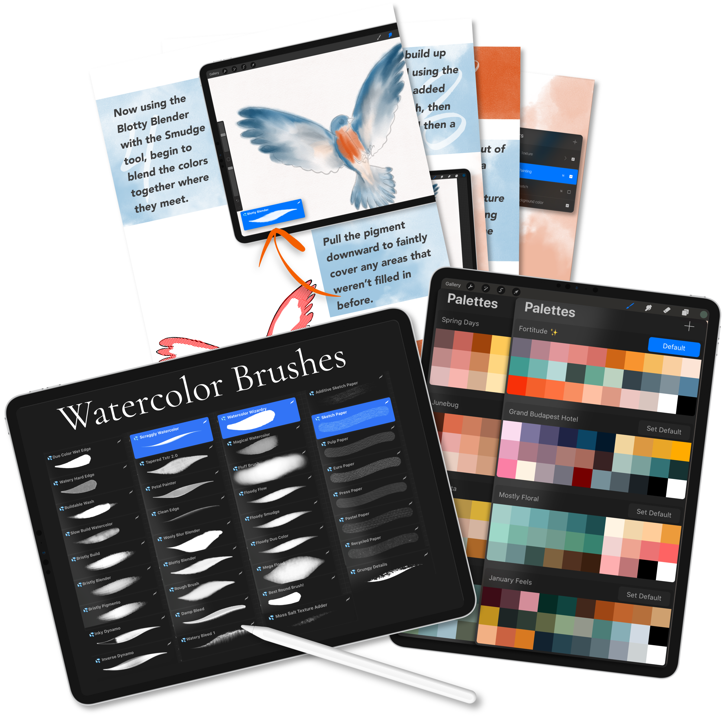
Before you make any changes, first make sure the brush has a reset point. If you go into "About Brush", you can hit "Reset brush" to bring it back to the default settings.
If you're adjusting a brush you've purchased, double check that the brush creator set a default reset point - this is a new feature (released in late 2019 with Procreate 5), so older brushes won't have it. If your brush doesn't have this stuff filled out, you'll want to go in here and create a reset point before you start changing things. And it's always a good practice to save a backup of your brush files someplace, either on a hard drive or in the cloud!

STREAMLINE
Found under "Stroke Path", increasing Streamline will add a smoothing effect to your brush stroke. This can be a great addition for hand lettering, calligraphy, or things that you'd like to get a fluid aesthetic for, such as leaves, vines, and stems. Increasing to the maximum amount makes the brushstroke almost sticky, with a kind of magnetic feel as you draw and paint. This attribute can also be a great sort of "beginner assistance", allowing you to easily achieve totally smooth lines.
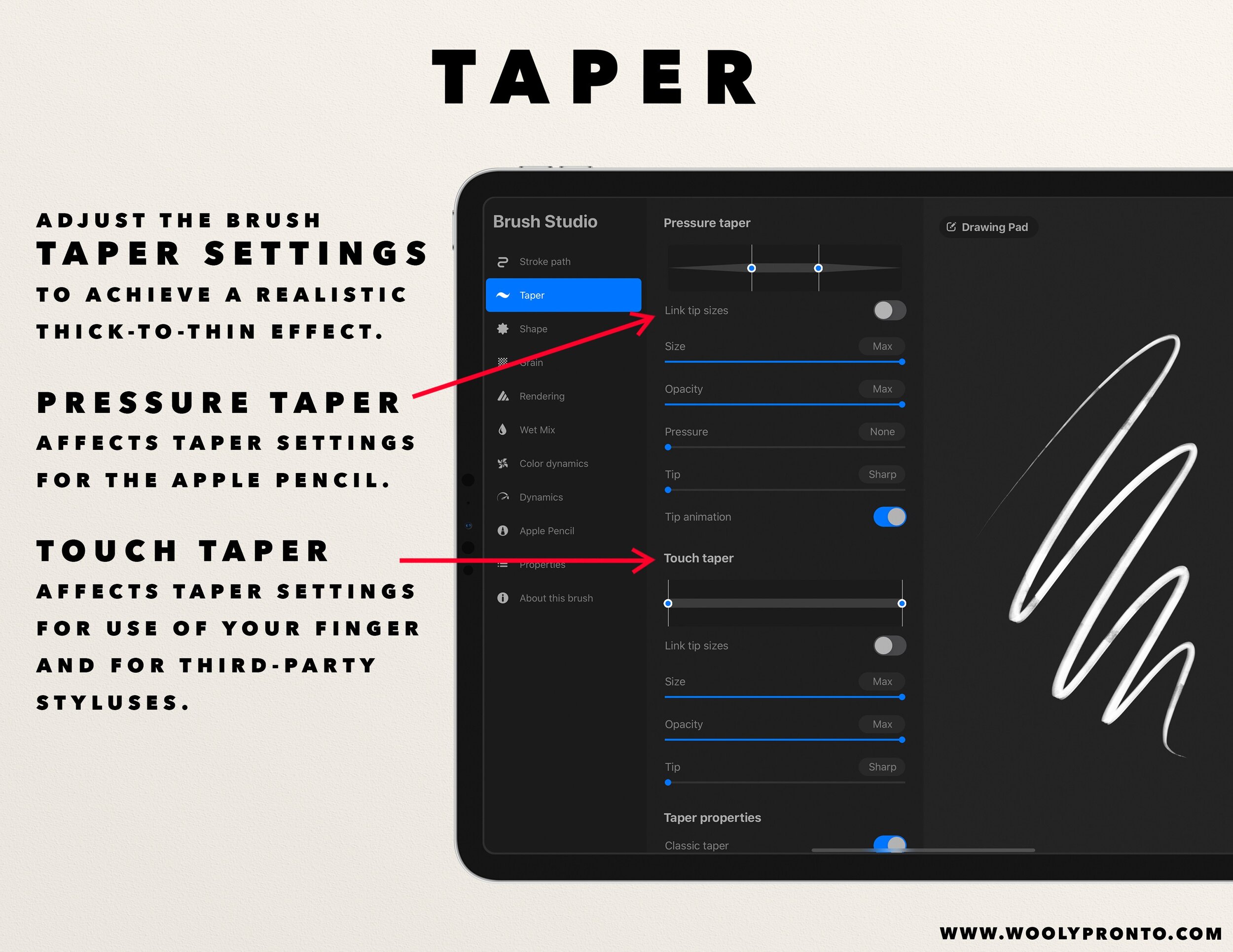
TAPER
Adjusting the pressure taper will mimic the thin-to-thick appearance of round brushes when using the Apple Pencil. You can adjust the taper to affect both the thickness and the opacity at the beginnings and ends of your strokes.
If you are doing florals or leaves, this function is super helpful to naturally achieve those shapes in the brushstroke itself.
Touch taper affects the taper of the brush when using your finger or a third party stylus to draw and paint.
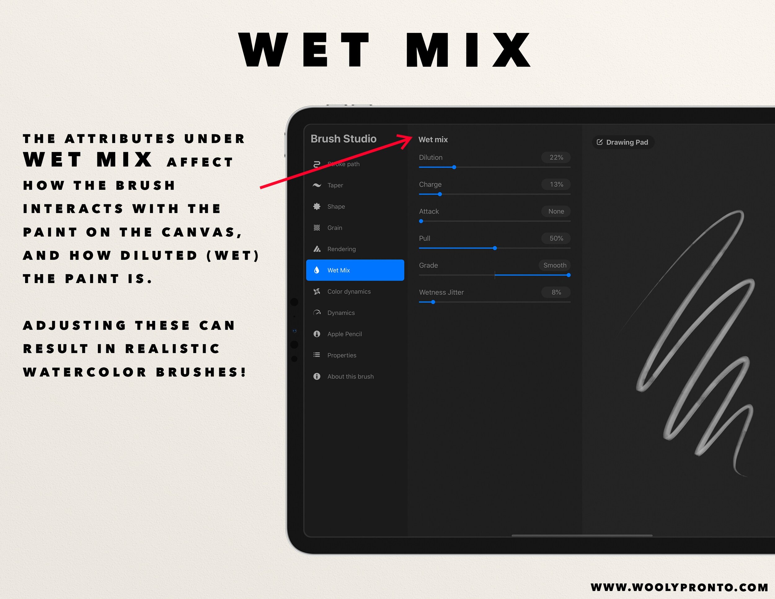
WET MIX
These super powerful adjustments affect how the brush interacts with the pigment as you paint, and how it interacts with what you've already painted. For the purposes of explaining, imagine we're painting on paper with actual paints and water.
Dilution
This is essentially how much water is mixed in with the paint on your brush, so the higher dilution the more transparent your brush strokes will be.
Charge
This is how much paint is on your brush at the beginning of your brushstroke. So if you paint a longer stroke, the paint starts to run out, lowering the intensity by the end of it. When you finish the brush stroke and start a new one, it is essentially "refilled" with paint again. To make this effect more obvious, combine it with more Dilution.
Attack
This is how much paint will stick to your canvas. Increasing this is helpful if you want to get an appearance of really thick, heavy paint. The higher the percentage of attack, the more consistent and bold your color application will be. Conversely, for watery appearances, change the attack amount to zero.
Pull
This attribute adjusts how much your brush will move paint around, including previous strokes on that layer. So this really takes digital painting to a more realistic level - allowing you to mix and move color as your paint, all with the paintbrush alone.
Wetness Jitter
This will cause a random amount of water to be mixed in as you paint, varying the color intensity. Especially for watercolor painting, this can add more realism.
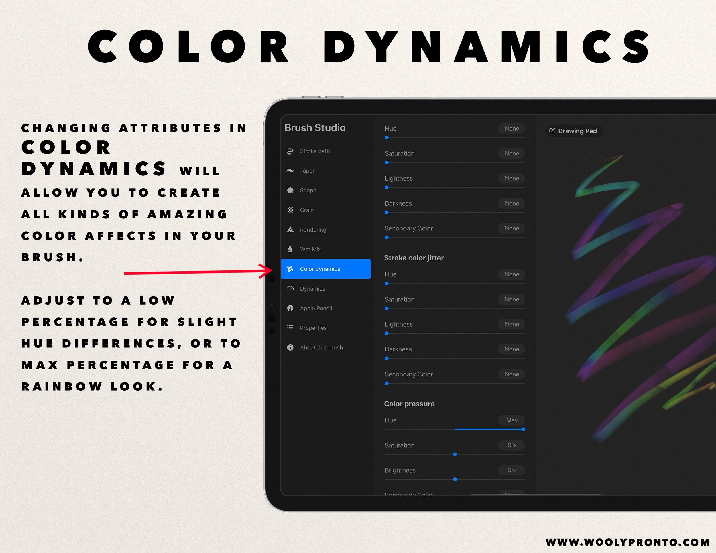
COLOR DYNAMICS
This update in Procreate 5 has been SUCH a game changer. It took me a bit to feel brave enough to venture into this, and I still don't think I've discovered the extent of what can be done here - but I'm finally feeling more confident in the adjustments I make.
First I'm going to run through a quick overview of what these sections affect, and then I'll highlight my personal favorite adjustments and customizations.
Stamp Color Jitter
This causes each stamp shape along your brushstroke to be affected, depending on which adjustments you've made. So, the entirety of the stroke of your brush is made up of individual stamp shapes strung together. If you have very little spacing, the individual stamps are imperceptible. If you have a lot of spacing, you will see them individually. This changes the color of each of those stamp shapes along the stroke.
Stroke color jitter
Each separate stroke you make deviates from the color you're painting with, depending on the adjustment you make.
Color Pressure
Depending on the pressure you use as your paint, you will see the effect of color variation.
Color Tilt
Same as the others, these changes appear depending on the amount of tilt you use with your apple pencil.
MY COLOR CUSTOMIZATIONS
Stoke Color Jitter - Hue / Saturation - 3-5%
I like to adjust these in super minor percentages, especially when I'm painting watercolor, or anything that I'm trying to achieve a more organic look with. It helps it appear that I'm mixing paints because there is only slight variation, but it gives a nice amount of depth.
Color pressure - Hue / brightness - 3-5%
This adjustment is fun for layering in feathers or fur, adding some serious depth by being darker at the beginning of a stroke and lighter at the end, or vice versa, depending on how you apply pressure as you paint.

APPLE PENCIL
Pressure Size
I love a good pressure sensitive brush, especially when painting loose florals with watercolor. Increasing this will make your brush stroke size larger the more pressure you apply. This can also really up the realism when you're painting.
Opacity
Similar with size, this will affect how transparent or opaque your stroke is, depending on the pressure applied.

PROPERTIES
Smudge
This adjusts how much the brush will smudge when you use it on the smudge tool. So if you are creating a brush specifically for blending, this is an important attribute to adjust.
Size
Here is where you can adjust the minimum and maximum size. If the size is maxed out and you still want to make it bigger, you can do this - to a point - by popping up to Stroke Path, increasing the spacing a few percent, and then going back to Properties and increasing the maximum size.
-
And those are my super simple tips for adjusting your brushes in Procreate! Thanks for taking the time to read. As always, happy painting!
Love Procreate?
Join the Pack!
When you join, you'll gain access to dozens of Procreate freebies: brushes, paper textures, workbooks, and color palettes. I send out weekly updates with my best tips and tricks, and you'll be the first to hear when new freebies are released!